
Annual Scientific Meeting
— Visual Identity Pitch
Two visual directions developed for a medical conference collateral suite
Graphic Design . Event Design . Concept Work
Project type: Client Work · Event Design
Role: Creative Director, Graphic Designer
Tools: Adobe Photoshop · Adobe Illustrator
The Problem
A medical professional association needed a complete visual identity for their inaugural Annual Scientific Meeting — a two-day conference at a Singapore healthcare institution. As a first-year event, there was no existing visual language to build from. The client needed a direction that felt credible and authoritative for a professional medical audience, while still carrying enough visual personality to mark the occasion as significant.
The Process
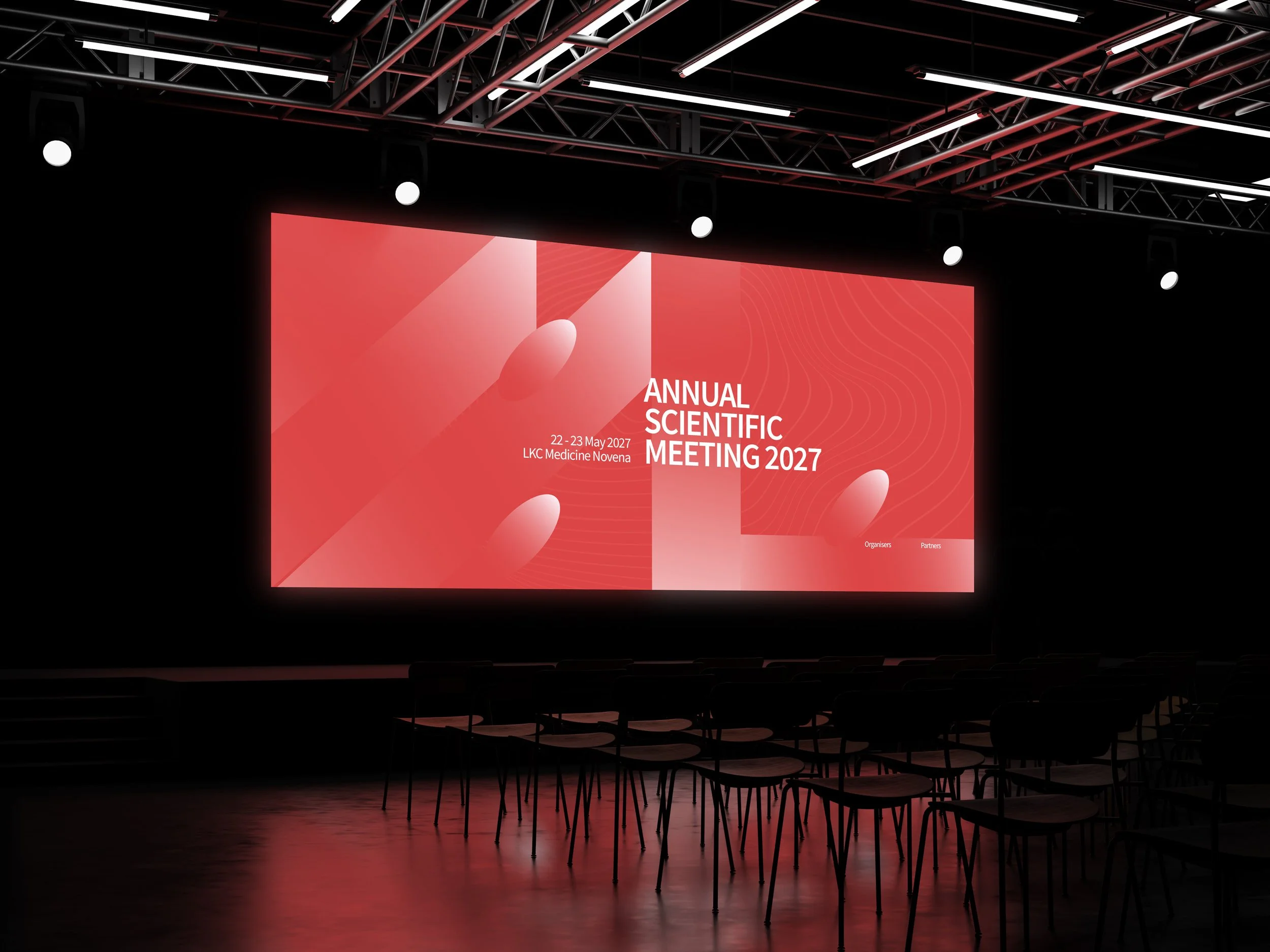
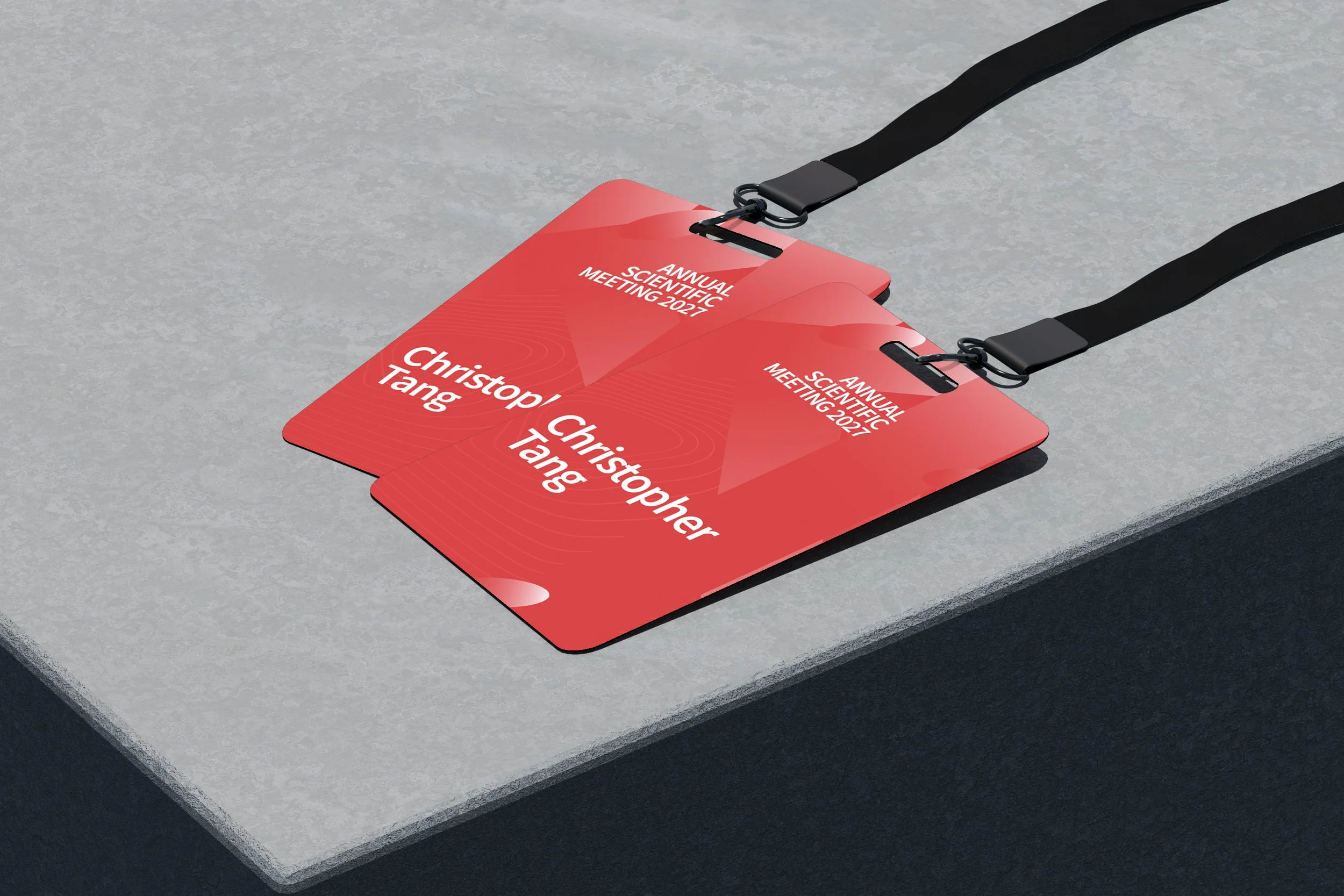
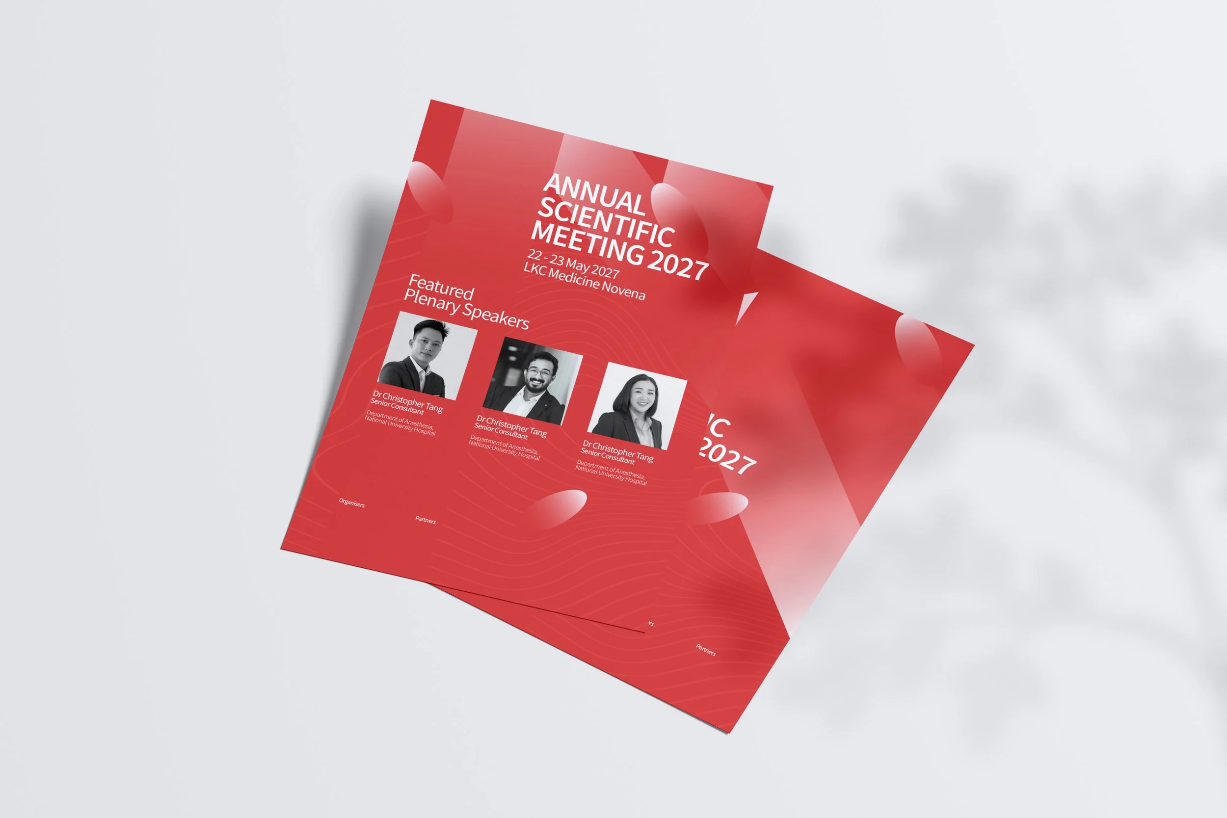
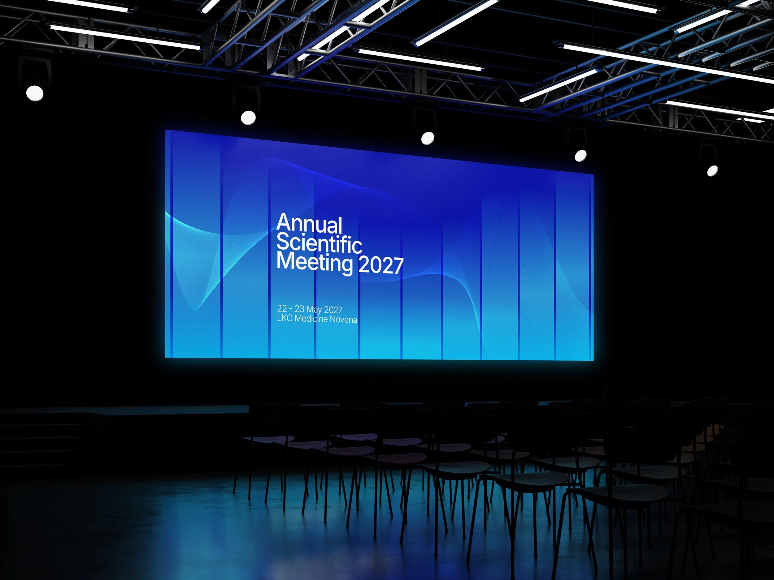
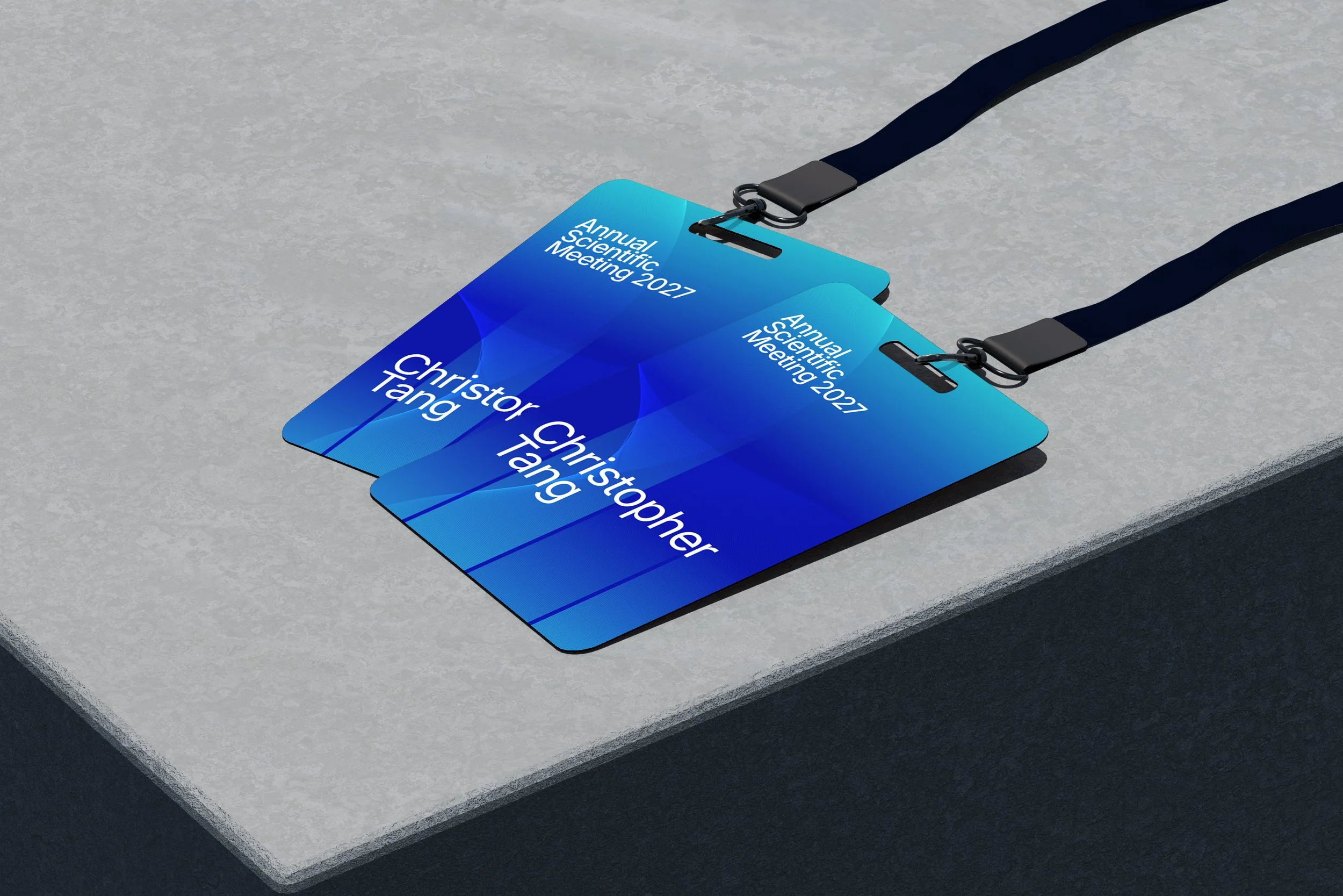
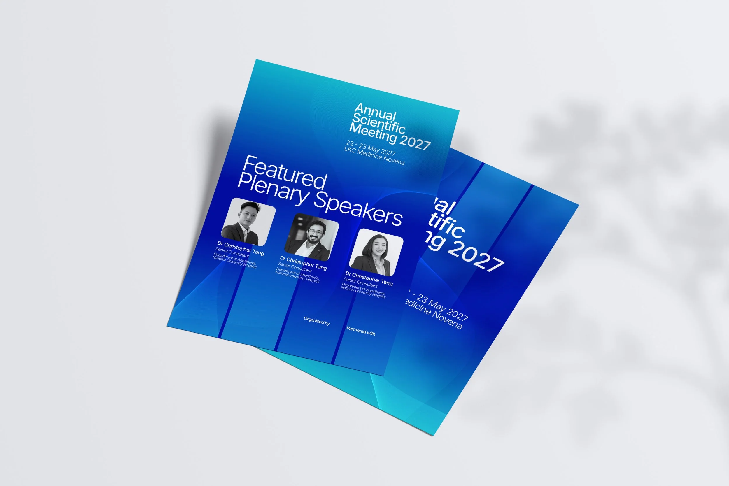
Rather than presenting a single direction, two fully resolved visual concepts were developed simultaneously — each exploring a different emotional register for the same brief. Reference directions were established early to ensure both concepts felt distinctly different rather than variations of the same idea. Each direction was then applied consistently across the full collateral suite to demonstrate real-world viability: stage backdrop, delegate name badges, and printed speaker flyers.
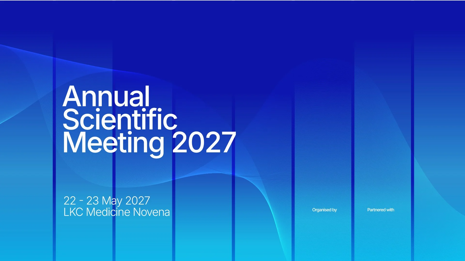
Design Mockup for Key Visual 01

The Solution
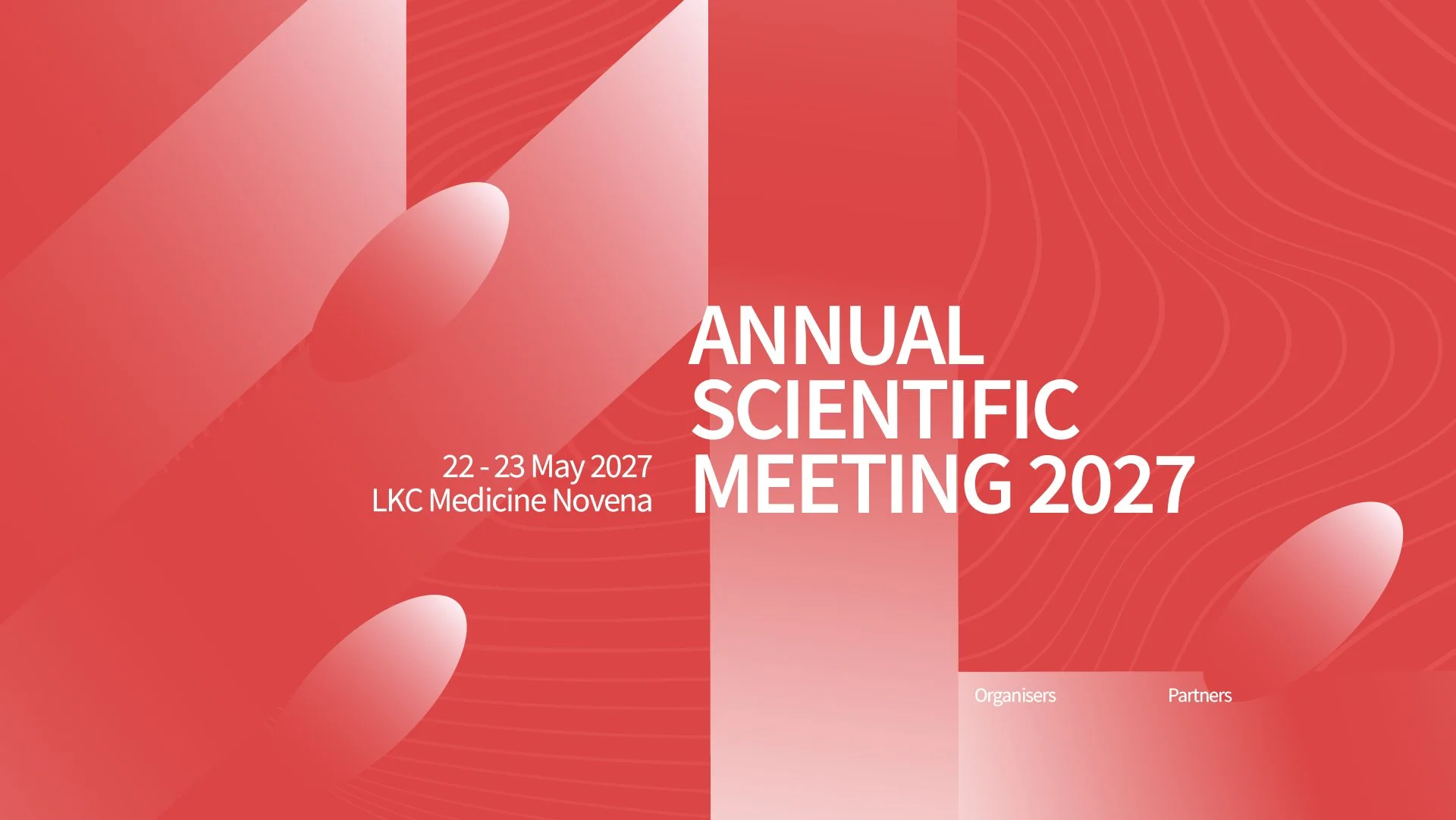
Direction 1 built around a cool blue gradient with fluid wave forms — clean, precise, and clinical in the best sense. Direction 2 took a warmer red palette with bold organic shapes, bringing energy and a sense of occasion to a landmark first event. Both directions were taken to full production-ready mockup standard across all three touchpoints.
The Outcome
Three complete, pitch-ready visual identities were delivered for client review. The selected direction has been withheld from this portfolio out of respect for the client relationship. The two remaining concepts are presented here as fully resolved examples of event identity work developed under a real brief, for a real occasion.
Design Mockup for Key Visual 02